Table of Contents
ToggleBuilding a User-Friendly and Responsive Website - Beginner Tips
It’s crucial to make your website responsive and user-friendly if you want to build one that draws visitors and encourages them to return. Whether you’re building a commercial website, a personal blog, or an online store, knowing how to build a user-friendly and responsive website best tips for beginners is imperative. In this tutorial, we’ll walk you through the best practices for developing a responsive web design that functions flawlessly across all platforms and makes your website stand out.
1. Maintain a clean, simple design
Creating a user-friendly website requires a straightforward layout. In order to enhance user experience, the finest websites for website design frequently emphasize simplicity.

Why minimalism is effective:
Users can locate what they’re looking for more easily with a design that is clear of clutter.
Best methods:
- Make extensive use of white space to draw attention to key information.
- For a clean, polished design, stick to a limited color scheme.
- Ensure that the site’s typefaces and icons are consistent.
Example: Websites like Google or Apple use minimalist designs to keep things easy to navigate.
2. Give responsive design a priority
Having a responsive design is essential because mobile devices account for over half of all web traffic. A responsive website ensures that it appears fantastic on all devices by dynamically adjusting its layout dependent on the screen size.
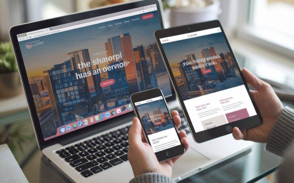
The important role of mobile responsiveness:
You run the danger of losing visitors who find it difficult to use your website on their phones or tablets if it isn’t responsive.
Best methods:
- Make use of adaptable layouts that change according on screen size.
- To make sure your website is user-friendly everywhere, test it across a range of devices.
Tools to help: Use Google’s Mobile-Friendly Test to check how responsive your site is.
3. Enhance the Speed of the Website
Customers will leave your website before it even loads if it is slow. Your SEO ranks will rise along with the user experience when your website loads quickly.
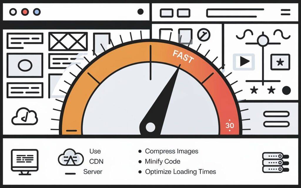
Why speed matters:
Users are satisfied when a website loads quickly, and search engines like Google will rank you higher.
Best methods:
- Image compression can speed up page loads.
- Employ a Content Delivery Network (CDN) to improve the global speed of your website.
- Use of bulky scripts and pointless plugins should be minimized.
Tools to use: Test your website speed with tools like GTmetrix or PageSpeed Insights.
4. Create Simple Navigation
A website must have effective navigation to be user-friendly. It should be easy for visitors to find what they’re looking for on your website; otherwise, they might leave.
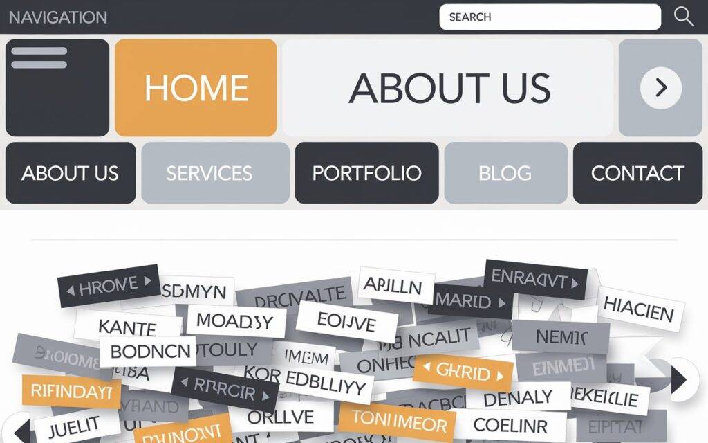
The significance of easy navigation:
Users are likely to switch to another website if they are unable to get what they need with a few clicks.
Best methods:
- Limit your menu to the essential elements and keep it basic.
- For menu items, use legible labels.
- To make it easier for people to find material, add a search bar.
5. Make Reading Easier
The easiest to read language is a key component of the top websites in terms of design. This entails utilizing headlines that are obvious, keeping fonts plain, and dividing text into manageable pieces.

The important role of readability:
Websites are scanned by people, so your material must be simple to read and comprehend.
Best methods:
- Choose readable typefaces such as Verdana or Arial.
- Use headings and bullet points to divide the information into parts.
- For optimal readability on all devices, maintain a font size of at least 16 pixels.
6.Use straightforward call-to-actions (CTAs)
Call-to-Actions (CTAs): These are the buttons that prompt users to complete an action, such as purchasing a product or subscribing to a newsletter. Users could leave your site without taking any action if you don’t have clear CTAs.
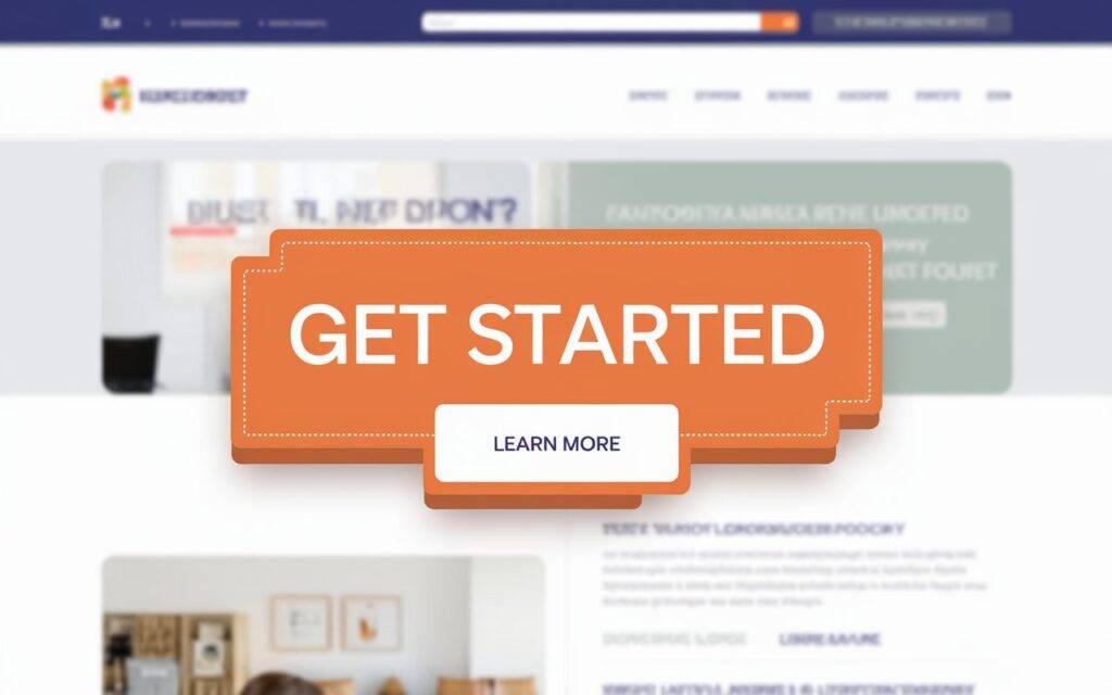
Why it matters to use CTAs:
Effective CTAs encourage viewers to take action and help you accomplish your website’s objectives.
Best methods:
- Employ verbs of action such as “Sign Up Now” or “Get Started.”
- A CTA should be placed across your website to capture consumers at various points.
- Use strong colors and bolder fonts to draw attention to CTAs.
7. Make Use of Great Visuals
Your website will be more engaging with images, but they must be handled carefully. All devices can view photos and videos smoothly and swiftly thanks to responsive web design.

Why images are important
Videos and images draw visitors in, but a website with too many big files may load slowly.
Best methods:
- To speed up load times, use optimized picture files.
- Don’t overburden your website with excessively massive files.
- Verify that the images you’re posting relate to the content you’re providing.
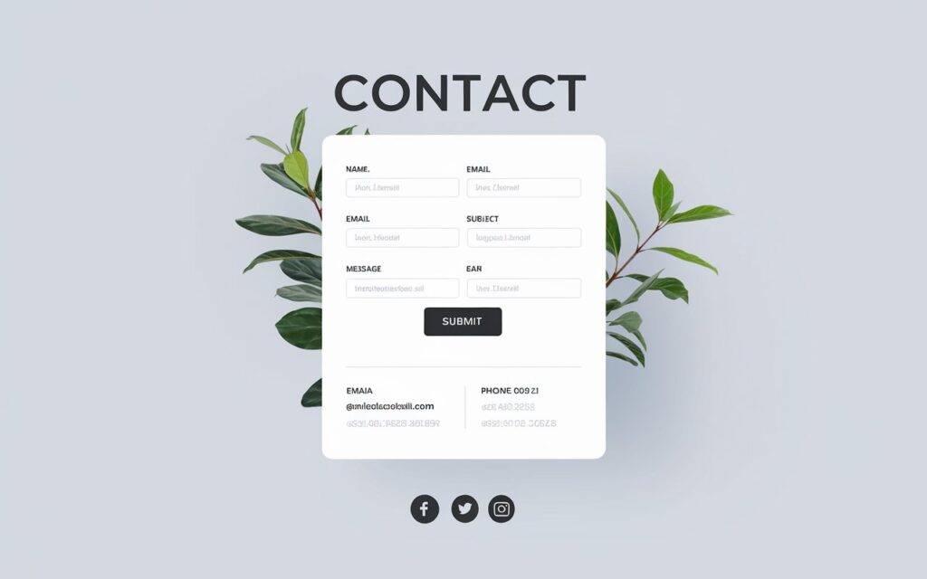
8. Make Finding Your Contact Information Simple
Whether you own a blog or a business, you want people to be able to contact you with ease. Your contact details should be prominently presented to foster audience trust.
Why it matters:
Contact information that is simple to find demonstrates professionalism and fosters a relationship with users.
Best methods:
- Provide your phone number, email address, and social media links on a Contact Us page.
- Put your contact information in your website’s header or footer.
In summary:
Building a user-friendly and responsive website is easier than you think. By following these simple tips—like keeping your design clean, optimizing for speed, and ensuring mobile responsiveness—you can create a website that works for everyone. Whether you’re just starting out or looking to build my website from scratch, these best practices will set you on the path to success.
Ready to get started? Explore more tips and resources on therushipandit.com to help you create the perfect website!
Home | Blog | Instagram | Facebook | LinkedIn

